Oz Reimagined Project Development
What would the Wizard of Oz look like in a postapocalyptic setting? This was the question I asked myself when redesigning the world and characters. I challenged myself to explore their world with characters, environments and transport in order to flesh out the concept and create an interconnected world that would be able to be explored in a medium such as a video game or movie.
I loved the process of researching all the different ways the story and characters had been adapted over the years as it provided me with what seemed like a never-ending supply of ideas and ways to explore their characters. The original depiction of Dorothy as a younger girl with silver shoes was my main starting point, allowing her youth and innocence to contrast with the harsher world and adult characters. The original story of the witch cursing the human Tinman to hit himself with his axe and repair himself with metal had so much potential with making an almost cyborg, zombie like character. This research also allowed me to tackle the issue I had with the original and movie witch design. This issue being the lack of visual connection between her and her henchmen. Her design was the most fun as I tried to link her to her henchmen by adding more bird imagery and move away from the classic witch design by looking into funeral director uniforms to give a grim reaper like feel for her role in the new world and story.
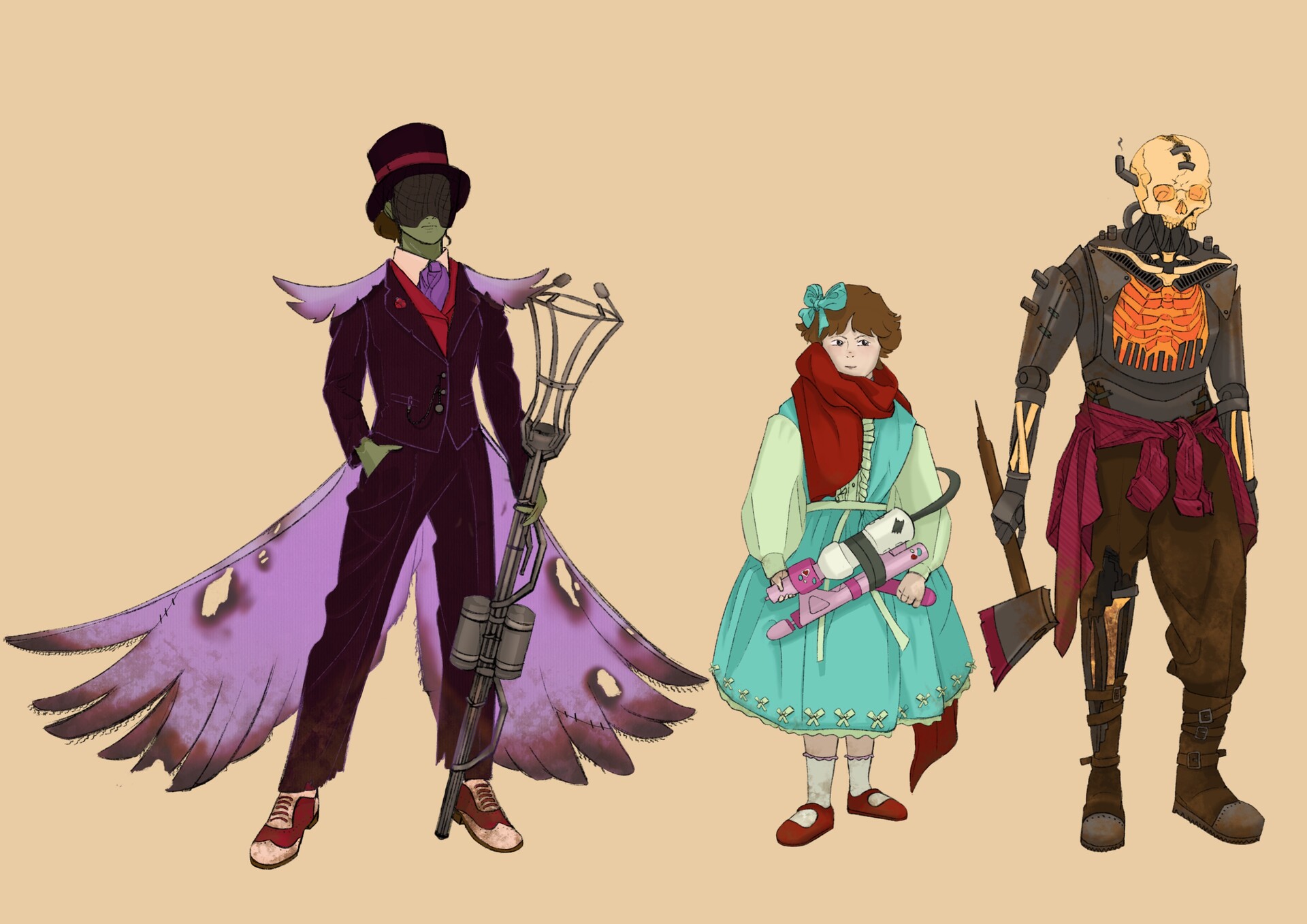
I challenged myself to move further away from typical apocalyptic styles like earthy colours and baggy shapes but keep the theme recognisable and clear. I also wanted the characters to feel connected to their world through objects they carry.

Dorothy needed to balance a classic apocalyptic look with the naivety of someone not born into the current world. Over time I imagine her design would become less childlike and more practical, inspired by Clementine from Telltales the Walking Dead.

Dorothy needed to stand out from the world and cast. To do this I assigned cooler colours to things more related to the past and warmer colours to those more related to the present. Her gun is a repurpose toy of the past, so it is a faded pink.

Tinman’s design needed to reflect his humanity but still explore how his body has been transformed. He needed a balance of robot and human. I explored this in the balance of machine parts, bones and clothes.

Tinman would be the heavier hitter of the travelling companions and as such I wanted to research how he might fight. Leading to some studies of how he might swing and throw his primary weapon. His axe.

I received feedback that he needed more clarity in his face leading to a more classic colour for his bone elements. While moving the Tinman’s colour to warmer tones I played with the idea of how he might be powered. This formed the furnace in his chest.

Although the witch the original move is iconic it has become very generic compared with other similar characters. I aimed to reinvent the design and give her a new and different feeling to match better with her role in the story.

I originally had too many ideas for the witch and struggled to pin one down. I eventually stuck with a funeral director motif. She needed to come off as an imposing leader and threat but still needed to show that the apocalyptic world had not been kind.

Colour was also something I was unsure about but eventually decided the classic green skin was the way to go and the purple complemented it while giving off the false royalty vibe I wanted.

My design felt flat and too clean. To fix this I pulled inspiration from her fire-based weapon and gave it some burn holes. I then revised this when it also proved uninteresting as well as cluttered to include some discolouration.

For the Witches vehicle I wanted to make the funeral director inspiration more apparent. The main idea was a Hearse modified to be a tank. The car features a furnace on the front connecting the Tinman’s origins to the witch and broom like appendages.

The witch works and lives in an old church inspired building. The area would act as an arena, so it needs to have the space while still being an interesting and unique area.

To help with layout and perspective I drafted isometric sketches to figure out which I liked best then modelled them in Maya. This also allowed me to visualise where I wanted the lighting to be.